Combo Boxes
Overview
Combo Box allows users to select a single option from a drop-down list, or enter new text in the text input box. This control displays the currently selected option. The drop-down list can be expanded or folded by clicking the arrow on the right side of the control.
Folded State

Expanded State

Properties
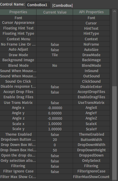
| Property | Description |
|---|---|
| Only Select | Set whether the text input box can be entered. |
| Dropped Down | Set whether the drop-down list of the control is open. |
Events
| Callback Name | Callback Function |
|---|---|
| on_get_capture | The callback when the control gets mouse focus. |
| on_lost_capture | The callback when the control loses mouse focus. |
| on_selected | The callback after clicking an option. |
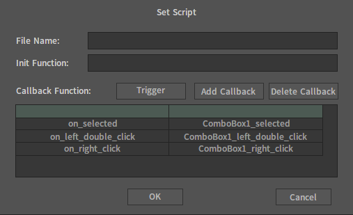
Lua Script Example
Self.InputEdit.Text = nx_widestr("ComboBox")
Self.DropListBox:AddString(nx_widestr("Button"))
Self.DropListBox:AddString(nx_widestr("CheckButton"))
Self.DropListBox:AddString(nx_widestr("ComboBox))
Self.DropListBox:AddString(nx_widestr("Edit"))
Self.OnlySelect = true
Self.DroppedDown = true

--  The callback function ComboBox_selected will be executed when lect-clicking the Combo Box.
function ComboBox_selected(self)
    nx_msgbox("ComboBox_selected")
end